
We had 2 hours before and 2 hours after lunch in workshop at the RWA without any breaks, how does she manage to stay so still? Slight downside to having no breaks – less chance to chat to fellow painters and nose at their work. After a bit of sketching I decided to spend the rest of the time on a single study. Zorn palette again, red,black,ochre,white. I was using flats for the portrait and was maybe slightly thinking of the Simon Davis portraits I’d seen in the week.

A real bonus was free entry to the current Reigning Cats and Dogs exhibition Pretty much 50% of the dogs featured were whippets, greyhounds or lurchers so I’ve absolutely no excuse for creating work based on the dogs. Fantastic to see the bronze greyhound sculptures that I admired a few years ago too. Still can’t afford them though!
Monthly Archives: January 2013
A chance to paint with Andrew James Vice Pres RP
I was lucky enough to get to see the London exhibition http://www.facebook.com/pages/Contemptible-Subjects-and-Other-Things-of-Interest/267994289951911 this week at the Menier Gallery. Sadly it’s now over. It was run by the three exhibiting artists and I was lucky enough to meet Simon Davis and Andrew James who were there at the time. I hadn’t realised I was so familiar with so much of Simon Davis’ work until I saw it in the gallery.
I was particularly happy to be able to talk to Andrew James as I’m in the middle of watching his Expressive Portraits DVD. I was lucky enough to have a long talk to him and he’d be happy to come to the Bristol area to run a weekend workshop if enough people are interested, so get in touch if you are.
Take a look at the incredibly powerful Ivy III portrait if you are in two minds.

Showing at the Cornucopia Exhibition at the Grant Bradley Bedminster in Feb
I’m really looking forward to showing with some other people from the Bristol Grammar Life Class next month from Feb 9th. I’ll be exhibiting portraits as well as life class sketches. There’s some great talent in the class and I’m looking forward to seeing their other work, it’s a mixed exhibition hence the name, here’s a preview page. Details of the gallery here.

What have Bristol Drawing Club, Adebanji Alade, Zorn, me and Kate Middleton got in common? #painting #portrait #palette #kate
I was lucky enough to get to see the ROI exhibition in the Mall Galleries last month, the painting that stood out for me was a painting of a homeless person by Adebanji Alade. The most remarkable thing about the portrait was that it used the Zorn palette only Cadmium Red, Yellow Ochre, White and Black!

http://adebanjialade.blogspot.co.uk/2012/12/the-face-of-homelessness-earls-court.html
The link shows a demo of him making the painting. I was impressed by the range of colours from such a limited palette.
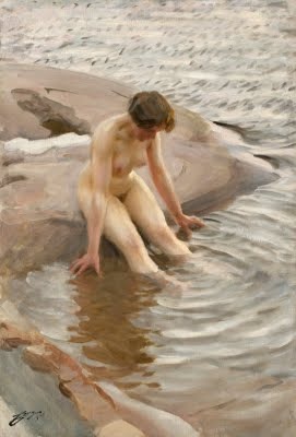
This palette is name after the Swedish artist Zorn who specialised in paintings of Scandinavian ladies on the way to have a bit of a goosepimply wash in a fjord, brrr.
This spurred me on to have a go and find a subject to try out the Zorn palette on. I’m a big fan of Bristol Drawing Club (http://bristoldrawingclub.blogspot.co.uk) where pub and sketching people meet seamlessly. What’s not to like? At one of these get togethers I sat opposite Jim for 60 seconds, sketching each other before we shuffled along to the next person, a bit like speed dating with pencils.
I ended up with this sketch, thank you Jim!
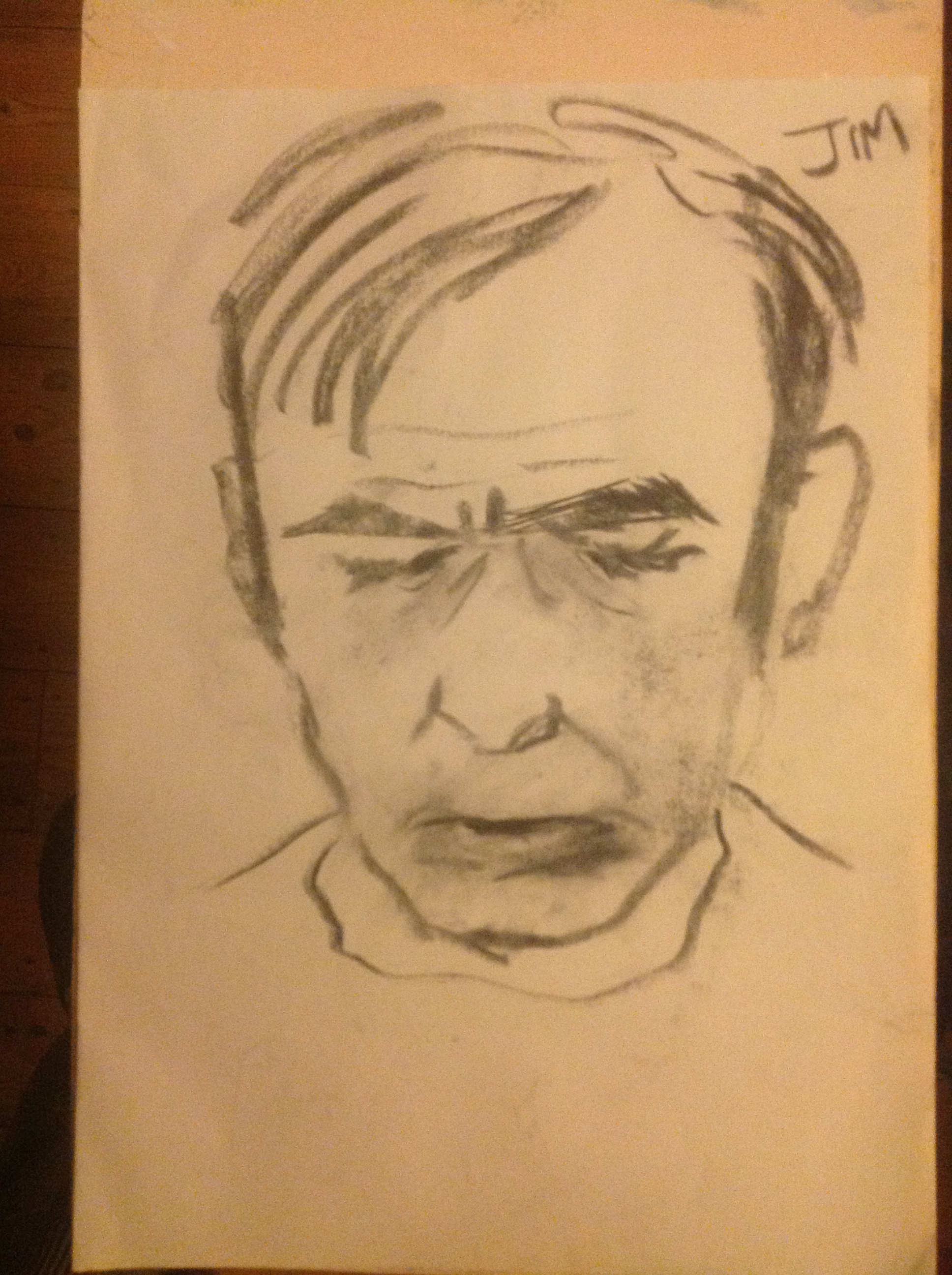
I thought I’d captured Jim as far as I could tell from our 60 second meeting, so I thought it was a good candidate to work up into a little painting.
First thing I did was to see what range of colours I could get out of this palette so started mixing. This is what I got…

I thought that was plenty of colours and set about painting using the sketch and some imagination to fill in the blanks in the sketch. I wanted to keep the colours separate and patchy and after an hour or two ended up with this…

OK, not a BP portrait award winner but a useful lesson For me on how useful and harmonised a limited palette can be and also a good reason to ignore anyone that is dogmatic about not using black in paintings, black and yellow ochre gave some beautiful olive greens.
Encouraged by this I had another crack, this time with a model called Ella who was darker skinned, I think the palette worked here too. Thanks Ella. It’s also pleasingly different to the Jim one.

When I was looking into limited palettes and in particular using black I stumbled across this article. http://willkempartschool.com/the-3-myths-of-black-in-mixing-paint-colours/ I was staggered to find a painter I was familiar with that painted large portraits using only Mars Violet (a dull red with a purple twinge), Blue-black and a bit of white.
Here’s one of his works…
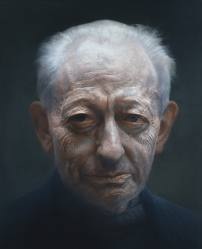
Pretty amazing for such a limited palette eh? It shows that accurate tone trumps hue every time. I must have a go with this palette next time out.
The artist is Paul Elmsley, he’s considerably better known today than he was when I first thought about writing this a few days ago, now what else is he famous for?
Oh yes…

I think he admitted himself that he was more cautious than he would have been with any other commission. Understandable I think and a pity if his career suffers. Thought this was a bit harsh ….

Lessons on how to price your work #art #pricing
I found this article to be really helpful when thinking about how to price my work. I also think that many of these comments are equally applicable outside the art world.
http://theabundantartist.com/5-art-pricing-lessons/
N.B.I take no responsibility for you never selling anything ever again but feeling good about it.

You must be logged in to post a comment.